Coda Contracting is a two-person local company specializing in plumbing, heating, and electrical installation, with a primary focus on heating and cooling systems. When the owners decided to launch the business, they came to me to develop a logo and visual identity from scratch.
With no existing branding to build from, I met with the clients to understand what they were after. Their direction was open with no strong preconceptions about style or approach, but the feeling they wanted to convey was clear: calm, trustworthy, and honest, while standing apart from the visual clichés of the heating and cooling industry. That last point proved to be a useful constraint. The category is heavily saturated with snowflake and flame icons, often paired with a house silhouette, imagery that is instantly recognizable but does little to distinguish one company from another. Avoiding that territory became a guiding principle for the project, particularly given that Coda's work extends beyond heating and cooling into electrical and sheet metal, a fact that made pigeonholing them with category-specific iconography an even less attractive option.
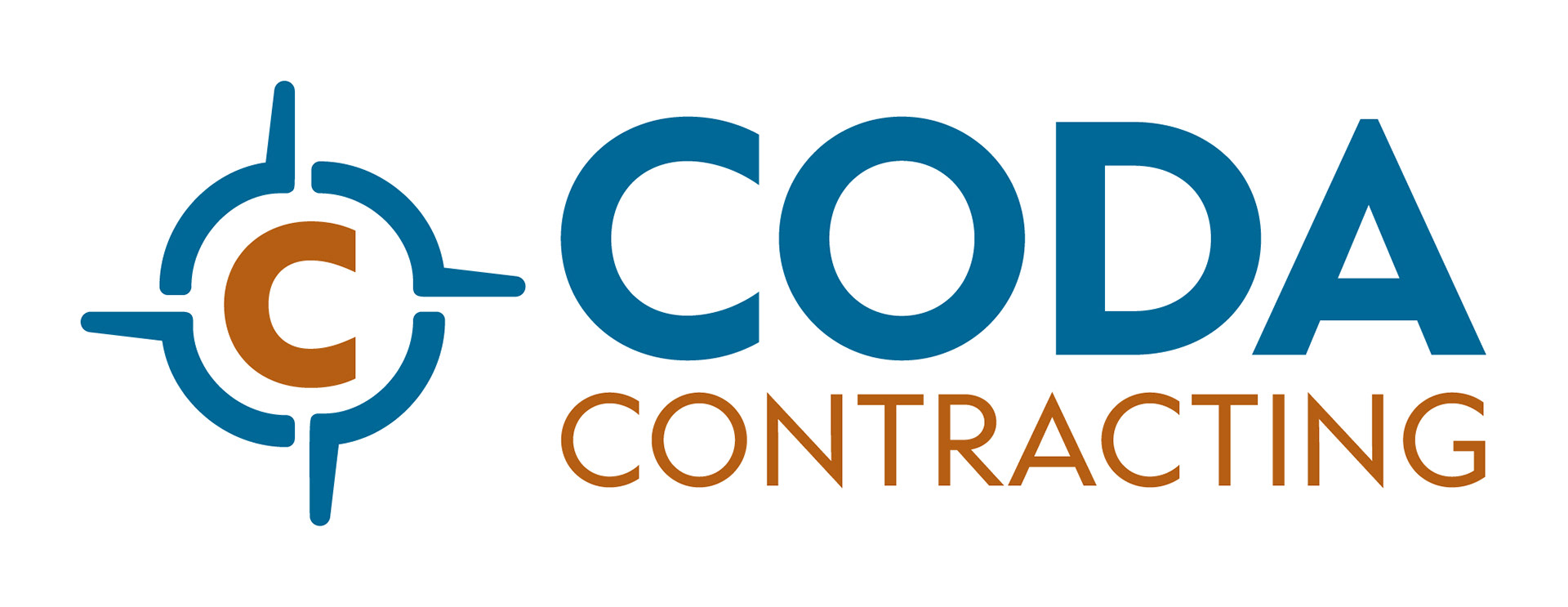
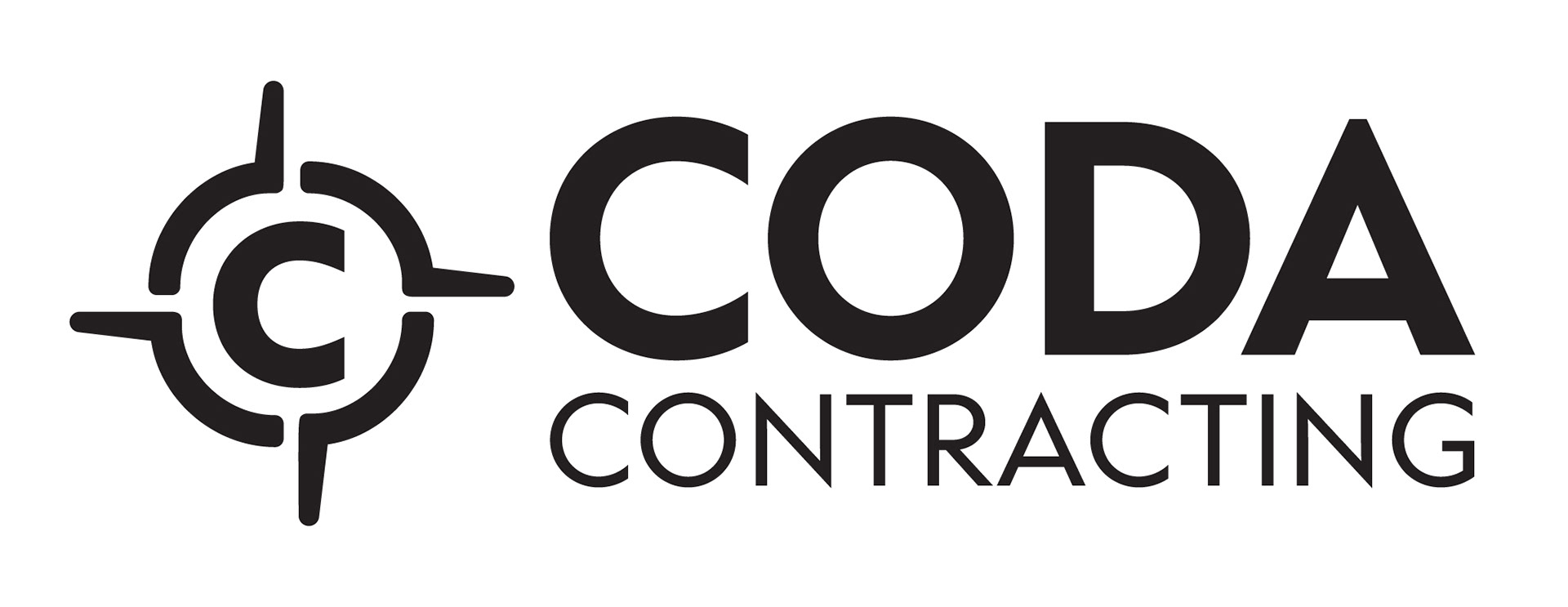
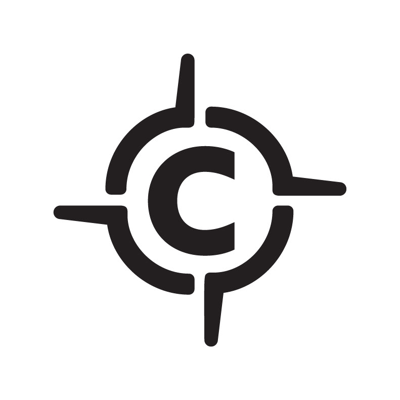
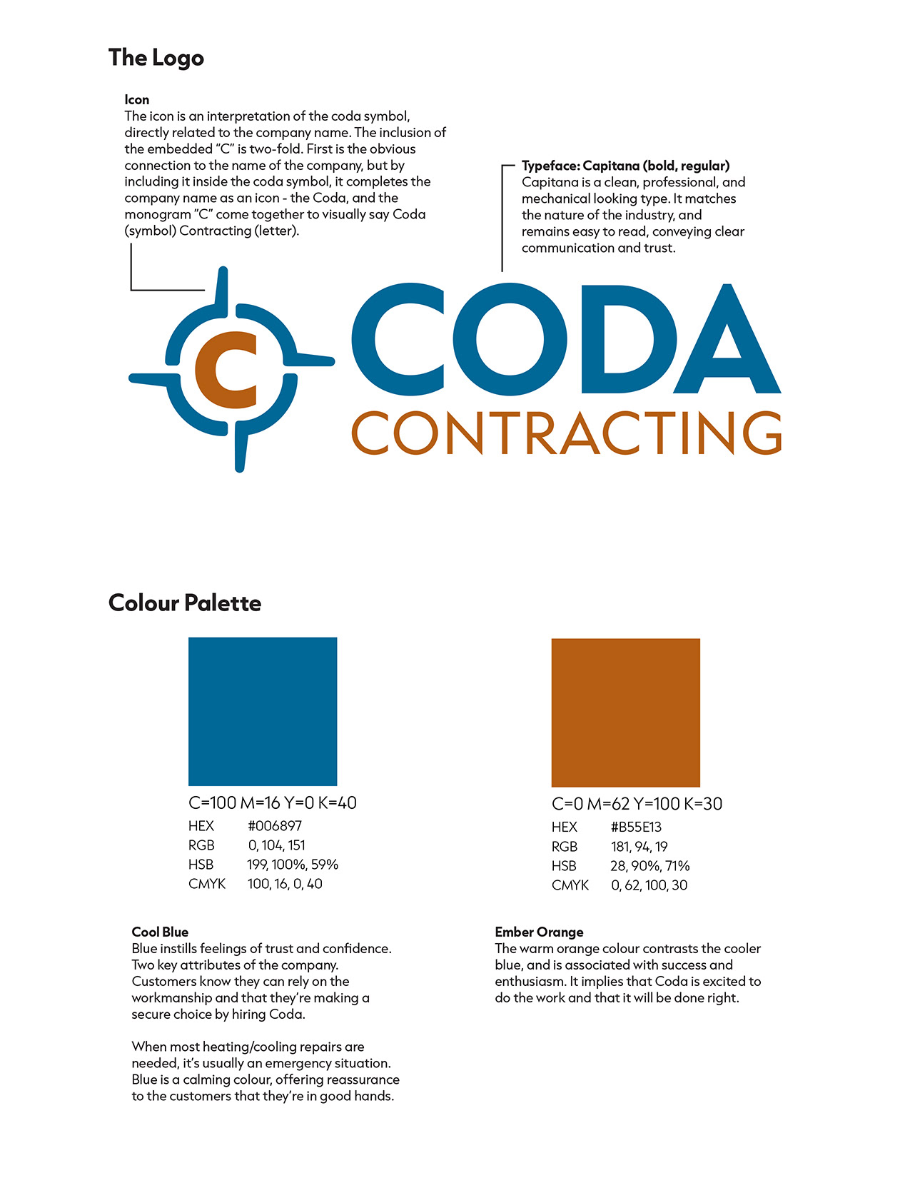
After the initial meeting and a round of follow-up questions, I worked through dozens of sketches before refining the strongest three or four directions into fully developed concepts for presentation. One concept explored the conventional snowflake and flame approach, included deliberately to give the clients an informed choice, but the direction that resonated was more unexpected. The clients had chosen the name Coda, a musical term for a passage that brings a piece to its conclusion, and I saw an opportunity to make the logo a literal visual interpretation of that name. The coda symbol from musical notation became the foundation of the icon, with a "C" monogram embedded within it, creating a mark that was distinctive, ownable, and completely free of industry clichés.
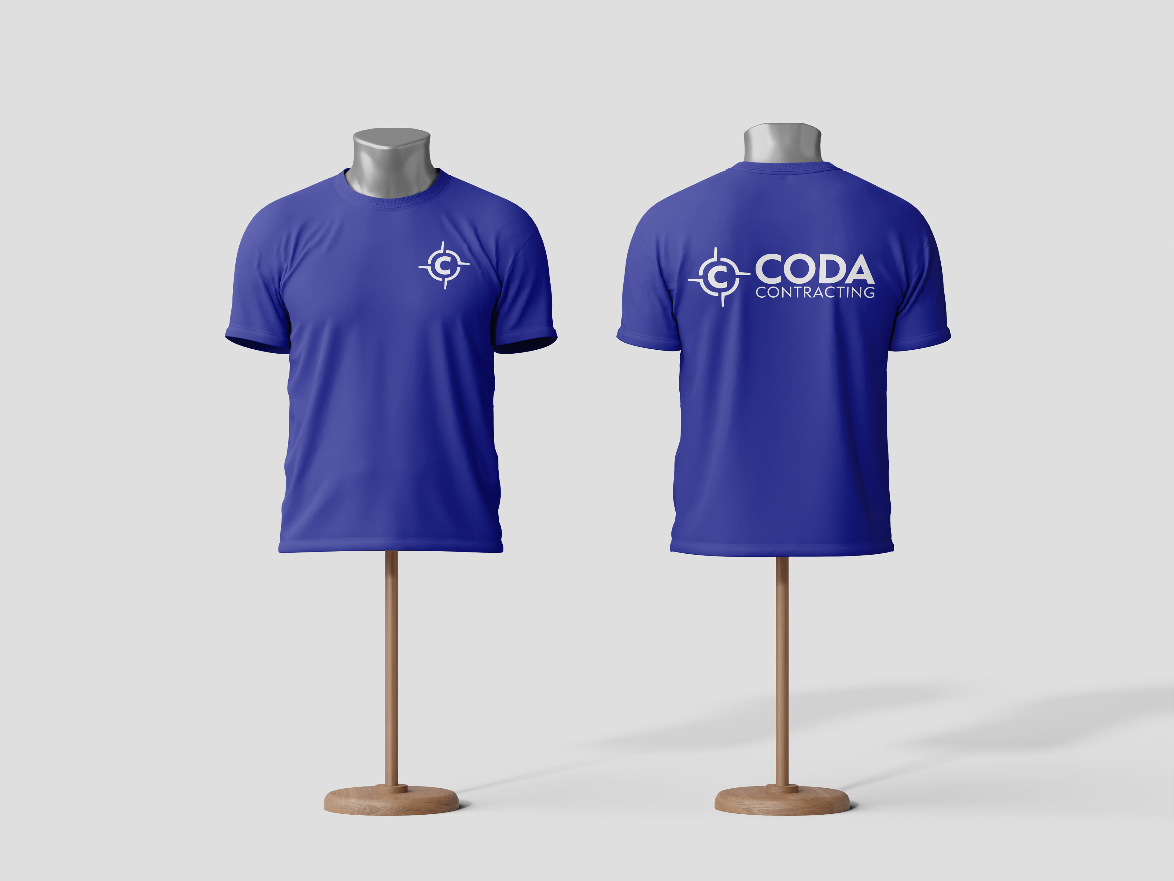
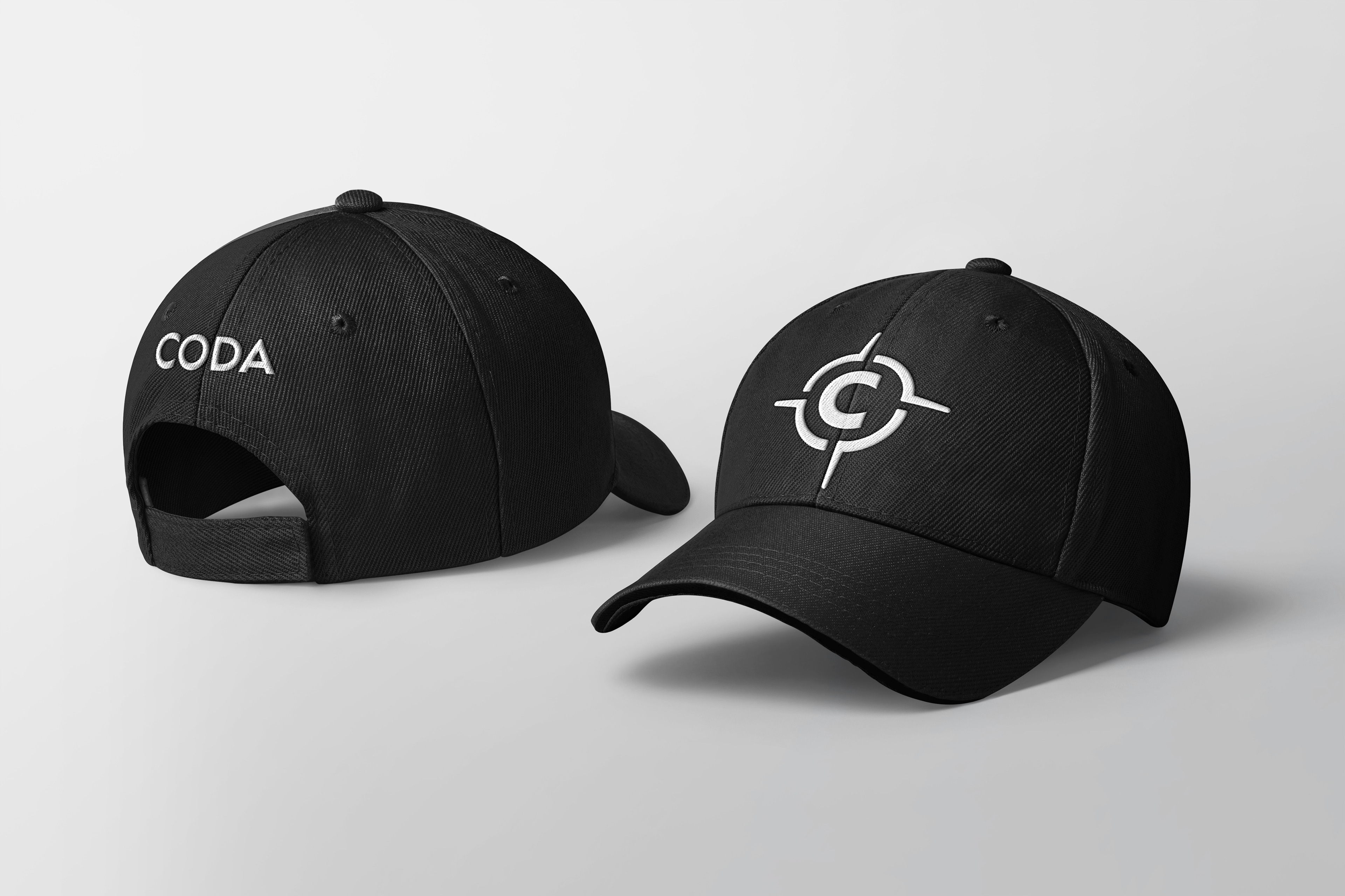
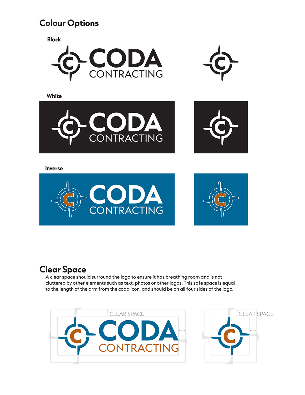
The name is set in Capitana, a clean and professional typeface chosen for its mechanical clarity and its ability to communicate trust and precision. The colour palette pairs a cool blue with an ember orange, a nod to the heating and cooling nature of the business that avoids the obvious, and a combination that evokes trust, confidence, and enthusiasm. The clients took a couple of days to consider the options before approving the chosen concept exactly as presented, with no revisions requested. I completed the identity in Adobe Illustrator, delivering a full suite of files (full colour, all black, and reversed versions of the complete logo, plus a standalone icon in each colour variant) to ensure they had everything needed for business cards, letterhead, and wearables.
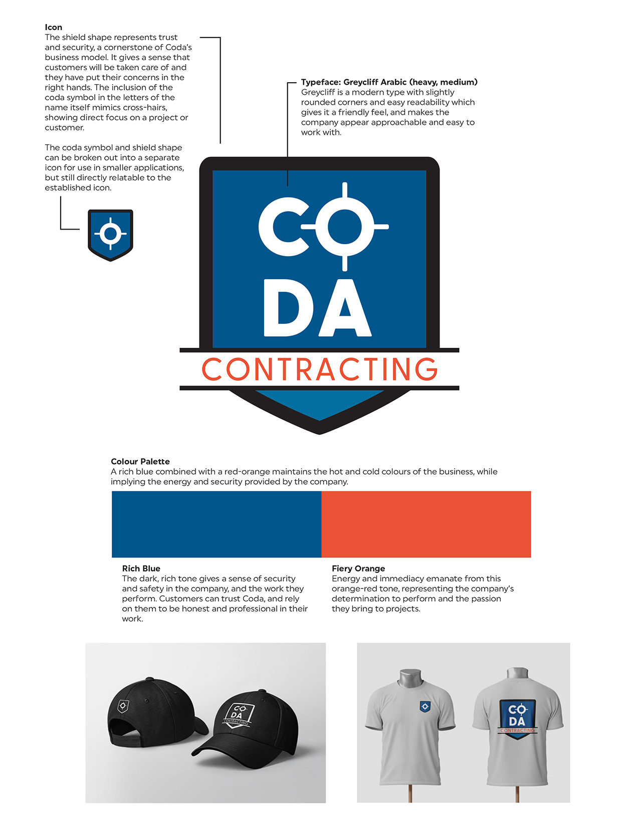
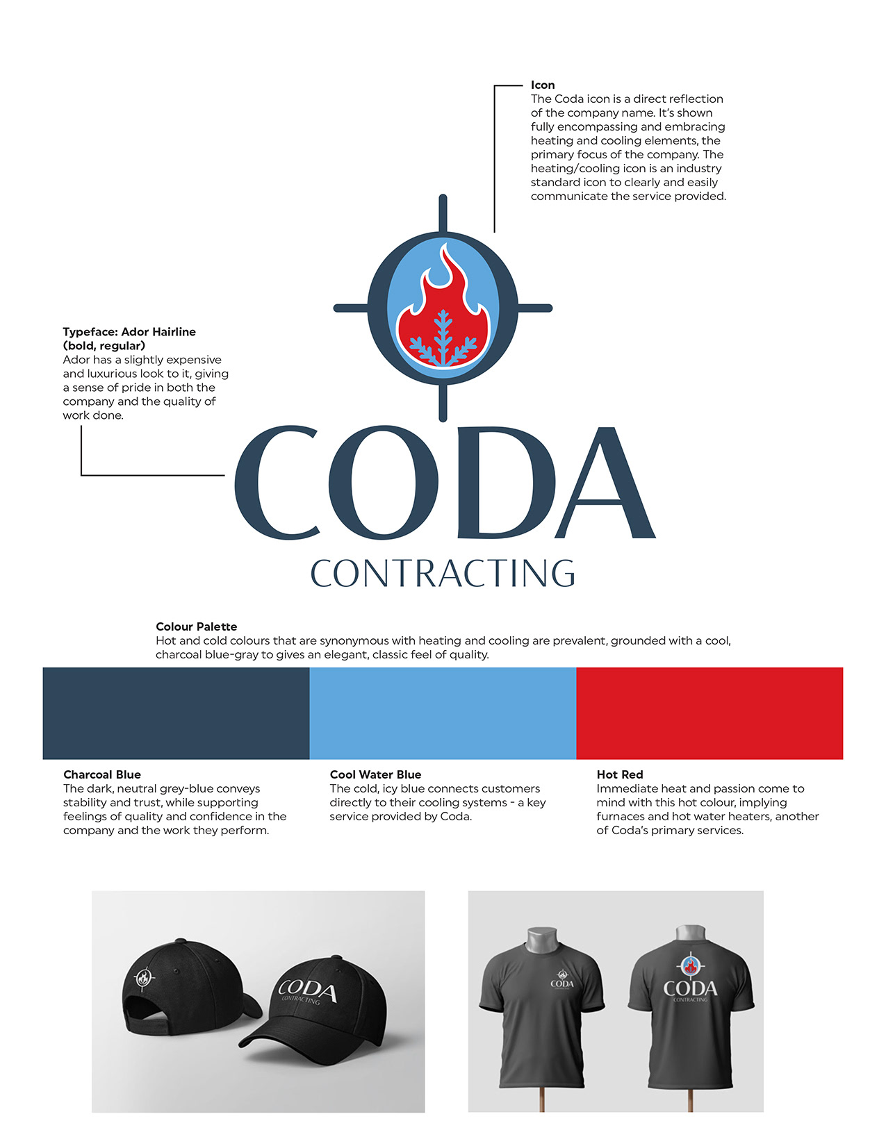
Alternate Concepts