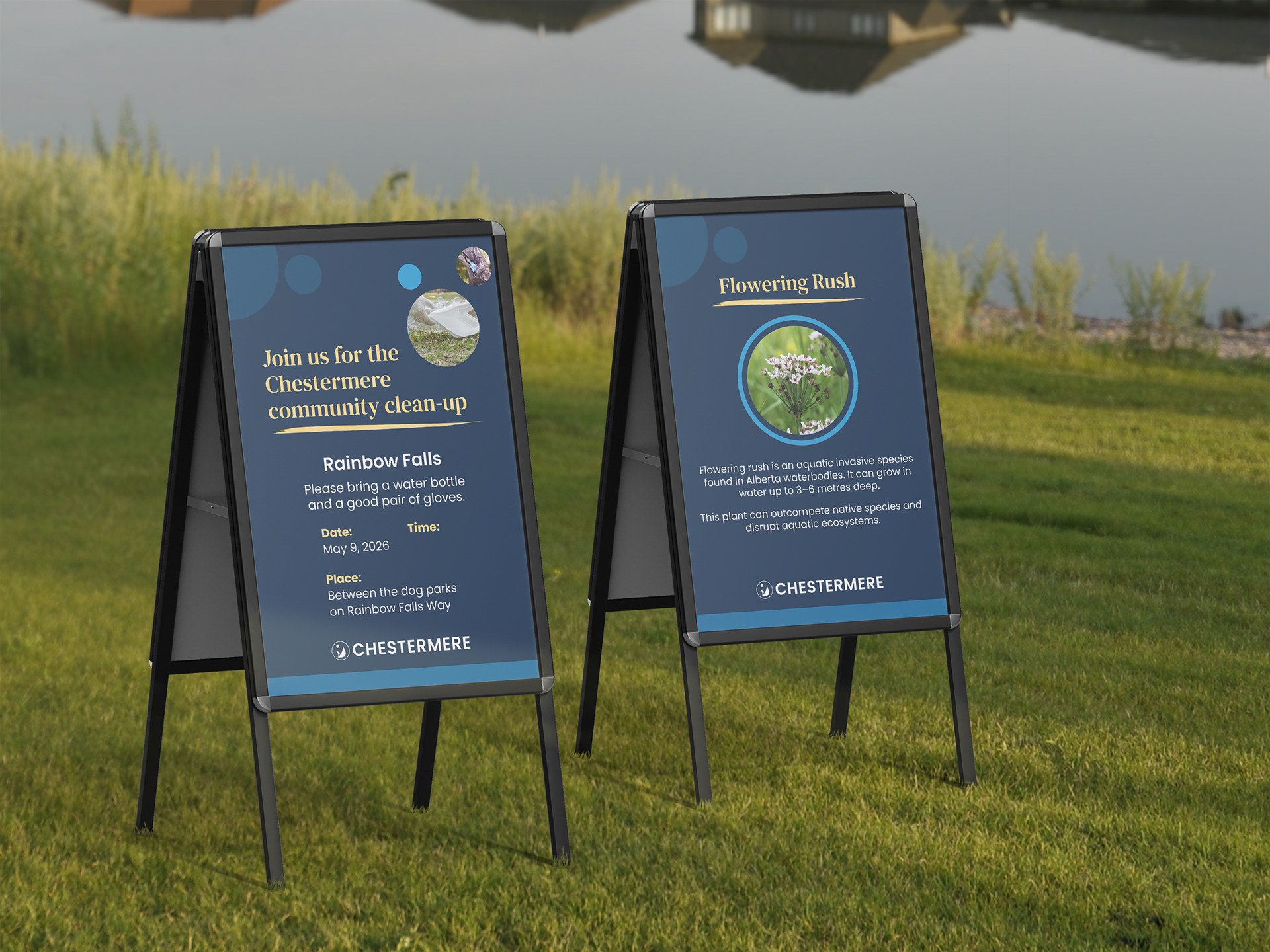
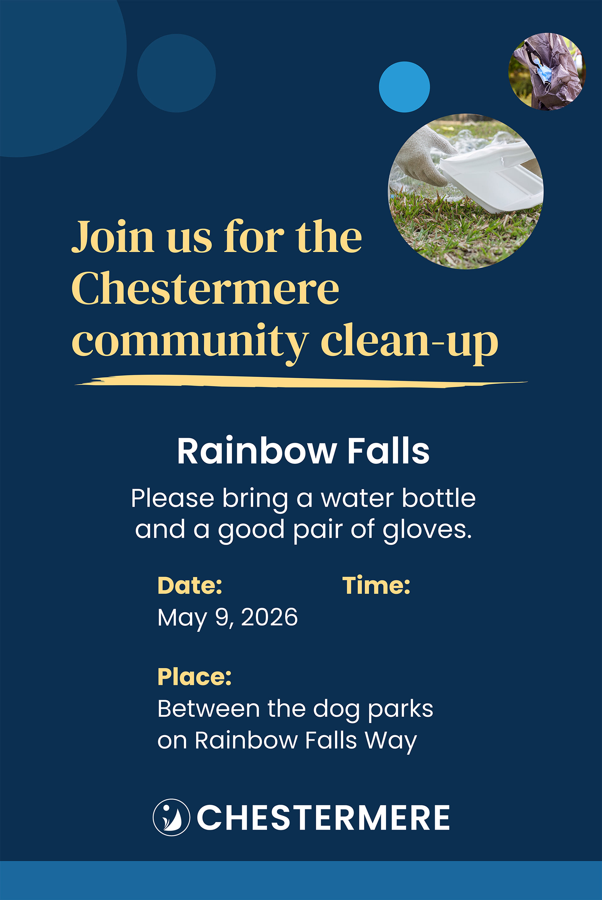
When the City of Chestermere's communications department needed signage for an upcoming community clean-up event, they brought me in to design the series, on brand and ready for print.
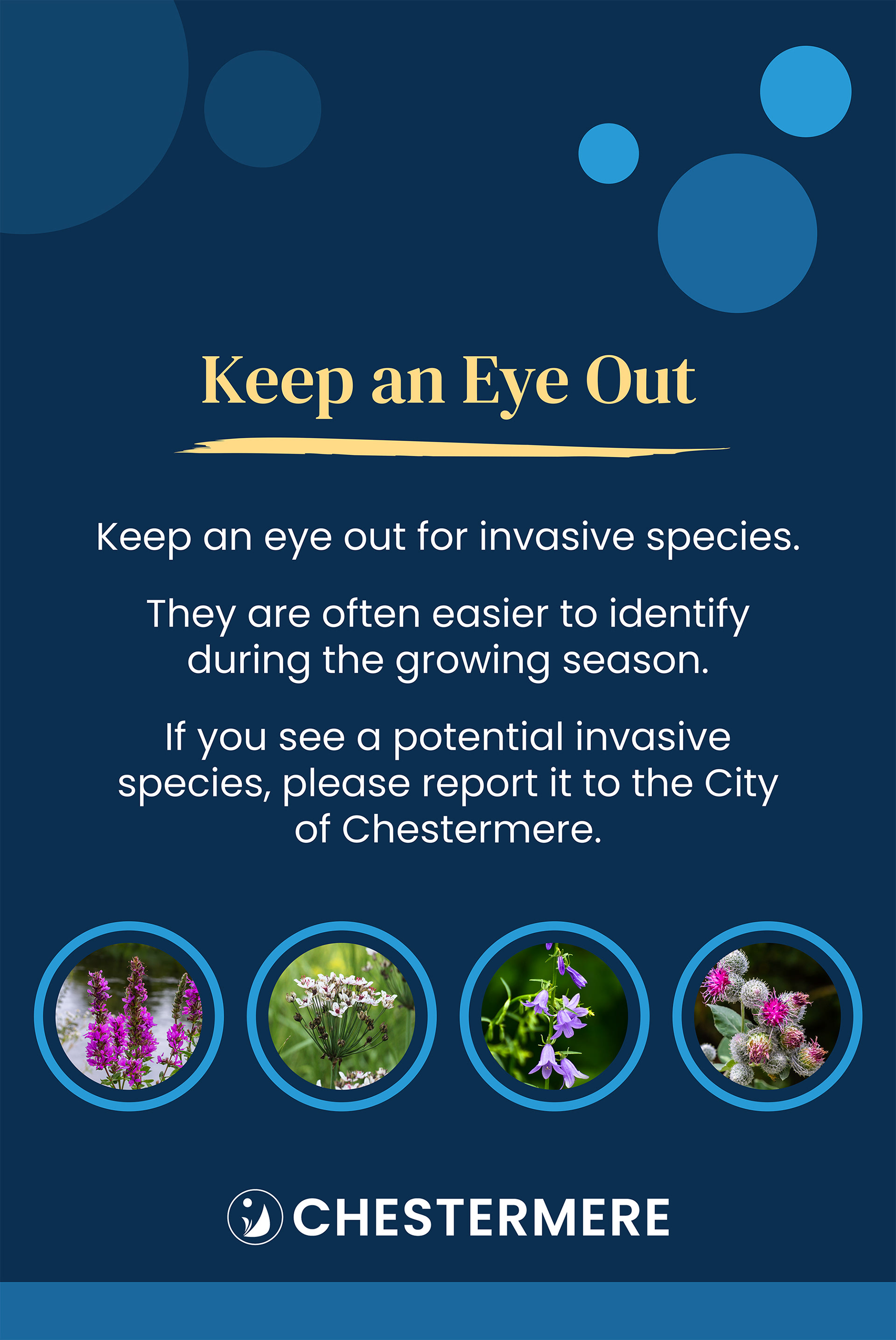
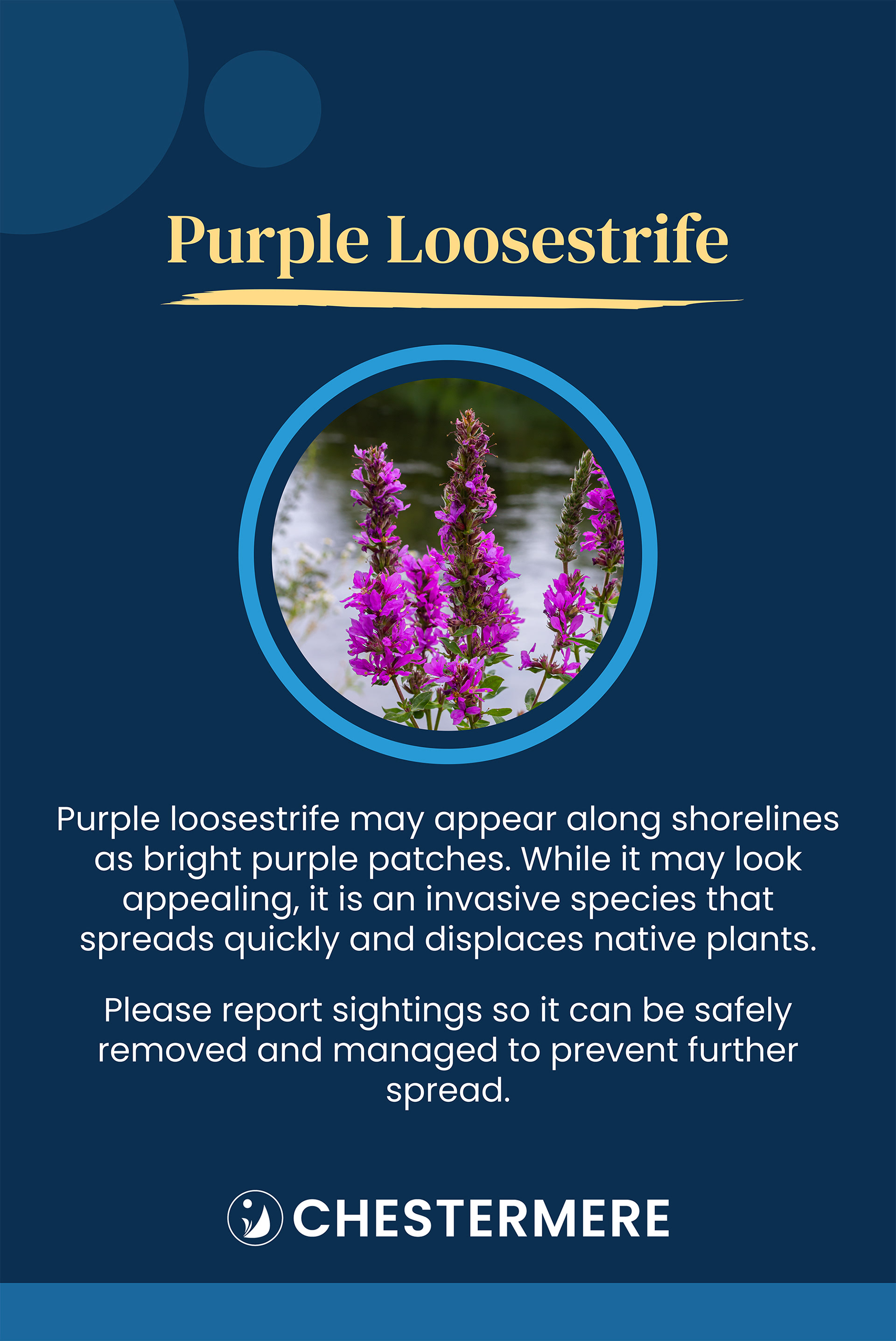
The series covered a lot of ground. One sign carried the event location and date, with blank space left for a sticker once the time was confirmed. Another flagged noxious weeds in the park and asked participants to report sightings, backed by another four dedicated signs, one per weed, each requiring a photo. A seventh promoted a local nursery attending to speak with volunteers, and the last pointed people toward a related informational session. To get the brand right, I asked for examples of past materials, which gave me a clear sense of the city's visual language to design around. Text was already written, and I sourced the photography, including images of each weed, sending purchase links along as needed.
The biggest challenge was the weeds themselves. Getting the species right mattered, so I spent time researching each one to be sure of what I was looking for. Once I knew exactly what to search for, sourcing the photos went quickly, though I still had to be selective, making sure each image showed the weed clearly enough for people to identify it in the park. The other challenge was consistency: eight signs, several very different content types, all needing to read as one family. I built the system around circular framing, used for photos, the nursery's logo, and decorative elements, echoing the circles in the city's logo and giving the whole set a visual thread to hold onto.
Everything was designed in Illustrator, with photos colour corrected in Photoshop. The signs went up ahead of and during the event, and both the requesting department and the city's in-house designer were happy with how they turned out.