
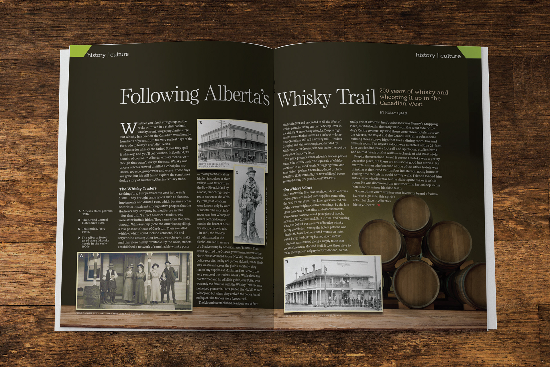
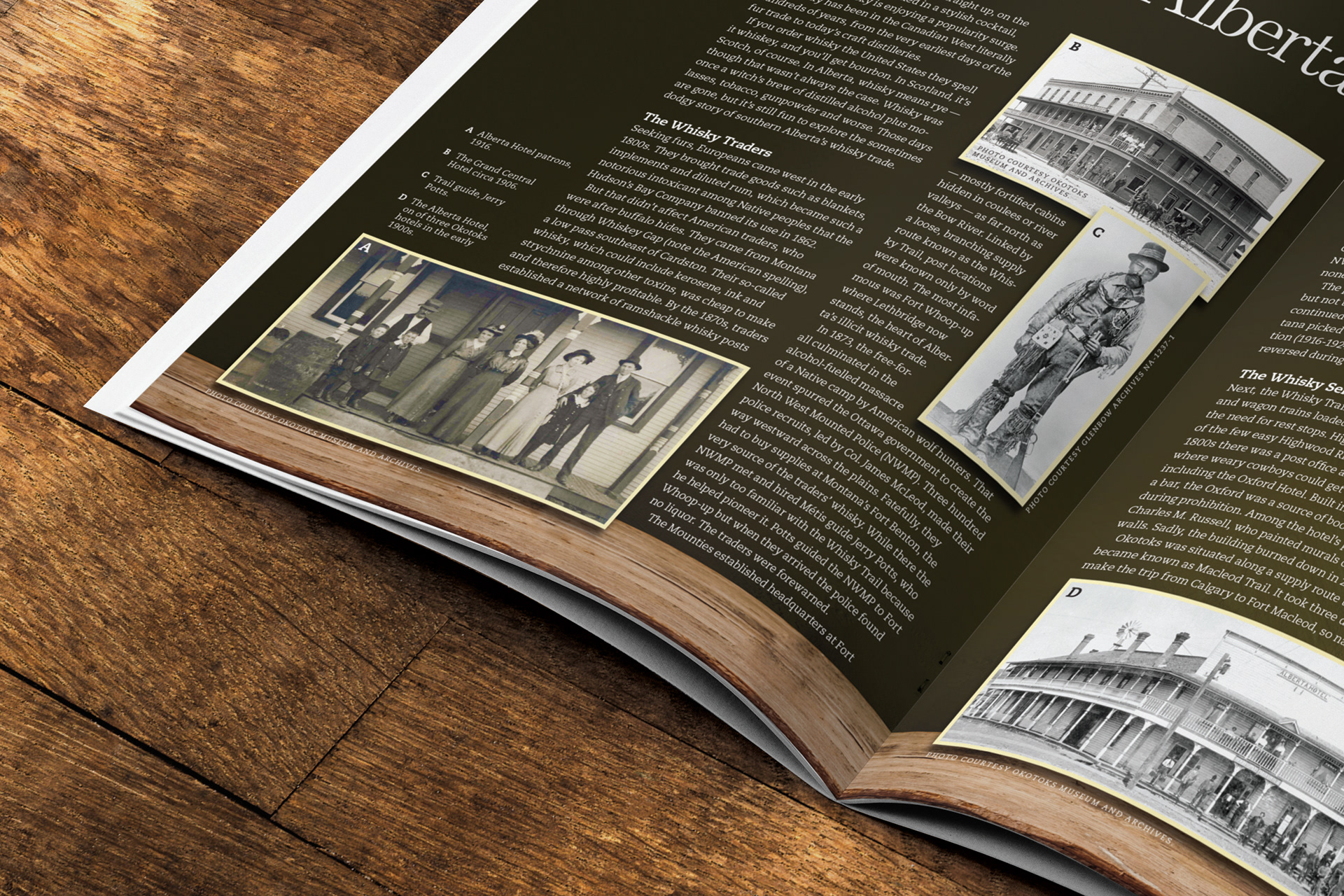
For this two-page history and culture feature in Okotoks Living, I was provided with a selection of historical photographs from the writer and tasked with developing a layout that supported an article on the regions whisky-running past. Working within the magazine’s established style guide, I sourced a simple stock background image and built a warm, vintage palette to reinforce the story’s era. The sepia and black-and-white photos lent themselves naturally to a historical tone, and I expanded on that with wooden textures and whisky-barrel motifs to anchor the spread visually.
The overall concept and composition were my own, designed to strike an effective balance between imagery and text across two pages. Much of the work involved flowing the article cleanly around the photographs without compromising readability, maintaining hierarchy and flow while still letting the visuals support the narrative. The goal was to create something immersive and nostalgic that felt true to the subject matter without overwhelming the editorial content.
I collaborated with the art director, who provided final approval on the design, and with the editor to adjust copy as needed for spacing and layout. Once the spread was finalized, it went to print without further revisions, serving as a visually rich, historically grounded feature within the issue.
© Source Media Group
© Source Media Group