
For Holstine Catering, I was asked to develop a tri-fold brochure and complementary four-page catering menu that felt clean, inviting, and subtly elegant. Using her logo and food photography as the foundation, I created a visual style that paired simple sans-serif body text with graceful cursive section headings, all grounded in the rich red pulled from her branding. With no formal style guide in place, I established a cohesive look across both pieces that reflected the tone she wanted and showcased her offerings with warmth and clarity.
Working in Adobe InDesign and Photoshop, I explored several early concepts to help determine the aesthetic direction before refining the chosen style. Collaboration with the client was close and iterative (mixing email reviews with in-person conversations) to ensure every detail aligned with her vision. I shaped the layouts around her content, finding a balance between photography and descriptive text, and making sure the menu and brochure felt like parts of the same family.
The most significant challenge came from the tri-fold itself: there wasn’t quite enough copy to fill all six panels, yet it needed to remain substantial and image-driven. By introducing a full-panel hero photo inside, we created a polished, high-impact solution that also reinforced the brand’s emphasis on presentation. The final materials were used at catered events, for leave-behinds, and as part of her sales outreach to businesses, ultimately giving her a professional, versatile toolkit she was thrilled with.
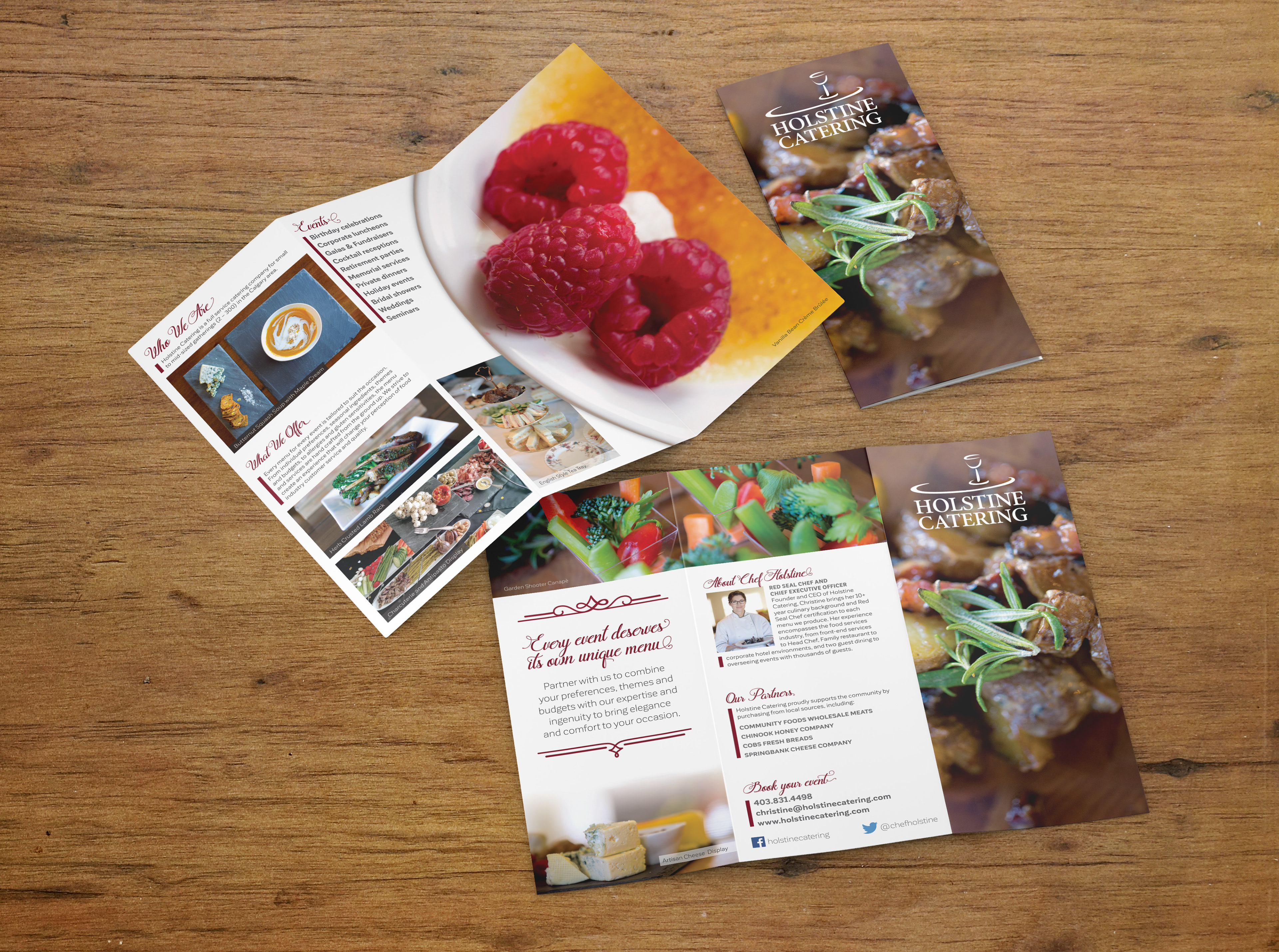
Trifold brochure
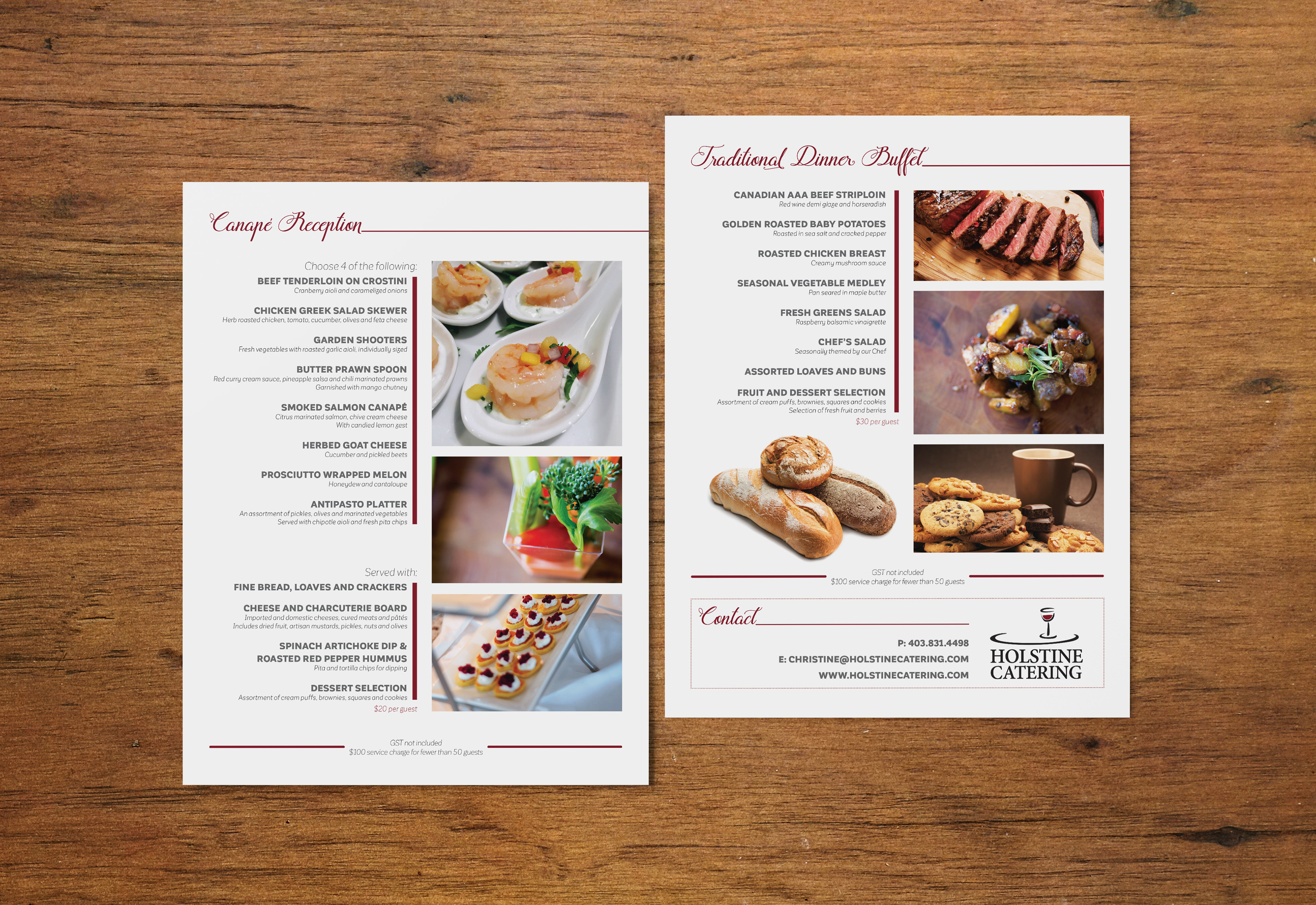
Catering menu pages